
Babysitting can give teenagers a way to learn responsibility and earn money at the same time. Seasonal school breaks and summer vacation are ideal times for teens to get babysitting jobs. Finding parents who need a sitter can be a daunting task for teens, and it is equally difficult for parents to find reliable people to care for their children. Babysitters can market their services to parents with an attractive, attention-getting flyer. Whether computer generated or hand lettered, babysitting flyers let parents know how to find a babysitter.
How to Word a Babysitting Flyer

Make a mental list of the pertinent information you want to include on your flyer, such as your first name, your age, an email address or phone number, experience, certifications (Red Cross Babysitting Class, CPR), your rates and perhaps days and times you are available. Also consider mentioning that you can provide references upon request.

Phrase your information clearly and briefly. For example, "Experienced babysitter" is a short and concise heading. "I am a very experienced babysitter and mature for my age" is too long and rambling. Succinct wording is best. After the heading, list your information:
Name: Mary
Age: 14
Email: [email protected]
Fee: $8 per hour
References: Available upon request
Experience: Have been babysitting for several families for over a year
Certifications: Red Cross Babysitting Course, May 2011
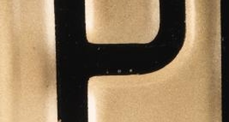
Select an easily readable font such as Garamond or Palatino. Include the word "Babysitter" in a larger font. Select no more than two easily read fonts for the flyer. Likewise, if you are making your flyers by hand, print clearly and neatly.

Choose two or three font colors (or marker/crayon colors). Leave some white space -- blank areas of the page. One small to medium image surrounded by white space draws the reader to the image and the accompanying text.

Select or draw graphics and borders if you like. Catch readers' eyes without distracting them by using only one or two interesting graphics. Choose images appropriate for your intended readers. Images of children, toys and playgrounds are good examples while pictures of tools, pop stars or race cars are not.
Experiment with different layouts. Design a few different flyers, and ask friends and family which layout grabs their attention. If possible, delay choosing the final design for several hours or until the next day, when you can be more objective about your work. Select the best flyer design to print or copy and distribute.
Related Articles
How to Send a Free Greeting Card to a ...

How to Find a Japanese Penpal

How to Make Babysitting Business Cards
How to Make a Family Tree Using a Free ...

Ideas for Prom Programs

How to Create a Childcare Ad on ...

How to Become a Mail Order Groom

How to Make a Volunteer Flyer

How to Make an Iron-On Decal

How to Block Numbers on a LG Phone
Invitations to Make & Print at Home for ...

How to Hide Marionette Wrinkles With ...

How to Map German Surnames

How to Find Mature People to Chat With ...

How to Advertise in Church Bulletins

How to Make a Rhinestone Template

How to Write a Biography or ...

How to Start a Fan Club

How to Start an Itinerant Ministry
How to Send a Free Birthday Greeting
References
Tips
- Always proofread your flyers! Check and double check the spelling and grammar. Ask an adult to proofread them as well.
- If you have restrictions, such as cigarette smoke or pet allergies or aversions, include this information on the flyer. This will keep you from getting calls you can't accept and will save parents time as well.
- If you charge a higher fee for more than one child or for babysitting after a certain time or on a certain day, note this on the flyer.
- Tabs cut along the bottom of your flyer with your email or phone number are handy for parents. Prospective clients can tear off your contact information while leaving your poster still hanging.
- If you don't have a computer, use a ruler to draw light pencil lines as a guide for your text.
- Look at magazine ads for inspiration and see how colors and images attract your eye. Consider ads or flyers you have seen that are sloppy or poorly done, and avoid copying that style.
Warnings
- Always have your parents review the flyer before printing or distributing. It's best to use your parents' phone number on the flyer rather than your own.
- Don't add your last name to the flyer.
- It's tempting to use fancy fonts, but they can be too difficult to read. Convey your information as easily, briefly, and clearly as possible.
- Meet prospective clients with a trusted adult present.
Writer Bio
Barbara Cannon began writing professionally in 2001, covering medicine and health. She also writes about topics in travel, culture and computers. Cannon holds an Associate of Applied Science in medical technology from Northern Virginia Community College and has completed the Microsoft-certified system engineer program at Glendale Community College.
Photo Credits
SW Productions/Brand X Pictures/Getty Images