JaysonPhotography/iStock/Getty Images
Every year, beginning in kindergarten up until high school graduation, picture day at school rolls around. Knowing what colors work well in school photographs is essential for taking consistently good pictures. From basic black to bright hues, certain colors work better than others. Learn a few simple rules and you can make a strong showing in many yearbooks to come.
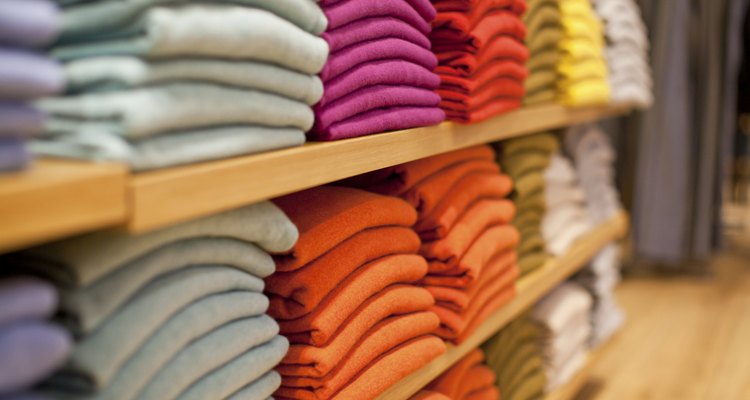
Medium and Dark Colors
Medium-to-dark shades of blue, burgundy, purple, orange and green look good in professional pictures, as these colors won’t blend into your skin and will highlight your face. When choosing a top, consider your coloring. If you have a warm skin tone (yellow or olive undertones), a warm shade like orange or red is a smart choice. People with cool coloring (pink undertones) will be complemented in clothing from the cool end of the spectrum, like turquoise or emerald-green.
Brights vs. Pastels
In general, vibrant colors -- think hot pink, cobalt blue and tangerine -- look better in school photos than pastels. Not only do these shades pop in pictures, but they also add brightness to the face. Pastels -- especially hues like peach, butter yellow and baby pink -- can wash you out by not providing enough contrast between your shirt color and your skin. Darker-skinned students are an exception to this rule, and look attractive in colors like lilac, soft blue and yellow.
Black vs. White
White has a tendency to absorb light, making it a less-than-optimal choice for picture day. On the other hand, black, as well as charcoal gray, is a much stronger wardrobe option for its tendency to pop and flatter without distracting. Additionally, black looks striking against a wide variety of backdrops; since you never know what the screen will be at a school photo session, black is a consistently safe selection.
Patterned vs. Solid Colors
The objective of a school picture is to showcase students looking their best, not to draw attention to a crazy shirt. It’s best, therefore, to avoid patterns like checks, polka-dots and florals, and instead keep the top in one uniform color. While a color-blocked shirt doesn’t have the distracting element of a tiny print, it can break up the visual line. Additionally, shirts with words or visible logos are also not an ideal choice. Stick to solid-colored tops that best complement your coloring, and you’ll have a yearbook look that will stand the test of time.
Related Articles

What Shirts Go Best With a Tan Suit?

What Color Shoes Go with a Gray Shirt?

What Color Slacks Would Go With a Light ...

How to Tell if You Need Yellow or Pink ...

Tips on Choosing the Right Color Dress

What Colors Look Good on Blondes?

Fashion Tips on How to Wear Tan & Light ...

What Color Clothes Makes Brown Eyes ...
How to Choose a Blush Color

How to Mix & Match Two-Piece Swimwear

All Natural Makeup for Teens

What Color Shirt to Wear to Make Eyes ...

What Colors to Wear in Group Pictures

What Goes With Navy Shorts?

What Outfits Could I Wear With a Bright ...

The Best Hair Color for Cool Skintones

Ways to Wear Zebra Stripes

Should Women Over 60 Wear Eyeliner?

What Color Heels Will Go With a Dark ...

How to Accessorize When Wearing Black & ...
References
Writer Bio
Stacey Kole was managing editor of the International fashion and beauty publication Savvy where she penned stories on all things beauty and style, while writing cover stories on such celebrities as Victoria Hudgens and Julianne Hough. She continues to write for a variety of online fashion, beauty and health publications.
Photo Credits
JaysonPhotography/iStock/Getty Images